Kodak Moments
Interaction Designer
Platform
Mobile/Web
Deliverables
Moderating design sprints
User Experience
Low fidelity wireframes
High/Low fidelity prototypes
High fidelity mockup
Kodak Moments is derived from the infamous Kodak brand which reinvented itself into a more modern and digitalized company optimizing AI for direct to consumer printing services. At Kodak my UI/UX accomplishments consisted of
improving the user experience by redesigning the customer journey of the company's web and mobile applications.

My Role
As an Interaction Designer at Kodak, I was responsible for improving the overall user experience by understanding user needs and creating human-centric interactions. I was given the responsibility to drive production for some of the key features from the discovery phase to the deployment of pixel-perfect designs on various platforms (Native App, Web, and Mobile Web).

The Problem
A big contributor to Kodak's success is their wide variety of print service options. One of the important print categories are the Greeting cards, which had some usability issues as well as issues related to pricing, text input, and design options. To summarize the problem statement, How can we improve the overall user experience while bringing price transparency and design clarity to Kodak Moments top products like Greeting Cards?
Should user upload their photos first or choose a card design?
How would the Interaction work when displaying card front/back/Interior?
How to display card color options?
The user needs a more intuitive way to input personal text.
Improve greeting card price transparency
Bring clarity
between different card corner design options
Improve preview zoom funtionality
Discovery
Design sprints are a proven way to find the best design solution in a short amount of time. I was involved in moderating design sprints around greeting cards to find creative solutions along with various stakeholders like PMs, Designers, and Developers.


The sprint resulted in various solutions which offered unique design opportunities and improve the overall workflow. But a good design solution always needs to be backed by user data, which requires thorough research and testing.


User Testing and Synthesis
Wireframes
Post discovery we had a lot of potentially great ideas, which I started to visualize by creating low-fidelity wireframes. This was an iterative process as we went over various user flows with stakeholders.

Low-Fidelity Prototype
I then presented a low-fidelity prototype to the team for comments, feedback, and refinements before user testing.
User Testing
It is very important for a user test prototype to be free of any ambiguity and confusion as it dilutes the user date. It is also important to choose the right demographic for the test. I was responsible for this process, as I set up the questions on UserTesting.com. The questioned were framed keeping in mind the objective and problems we started with.
Evaluation
The tests were screen recording of users working with the prototype. I evaluated all the videos and summarized the finding in a text ready format. This process also involved scoping users demographics and other information which helped synthesize the findings in the best possible way.

Synthesis
I went through all the user test date and performed a qualitative analysis of the user tests. This confirmed a lot of our design decisions as well as suggested fine UI changes which can be integrated into the final design stage.
Should user upload their photos first or choose a card design?
How would the Interaction work when displaying card front/back/Interior?
How to display card color options?
The user needs a more intuitive way to input personal text.
Improve greeting card price transparency
Bring clarity
between different card corner design options
Improve preview zoom funtionality
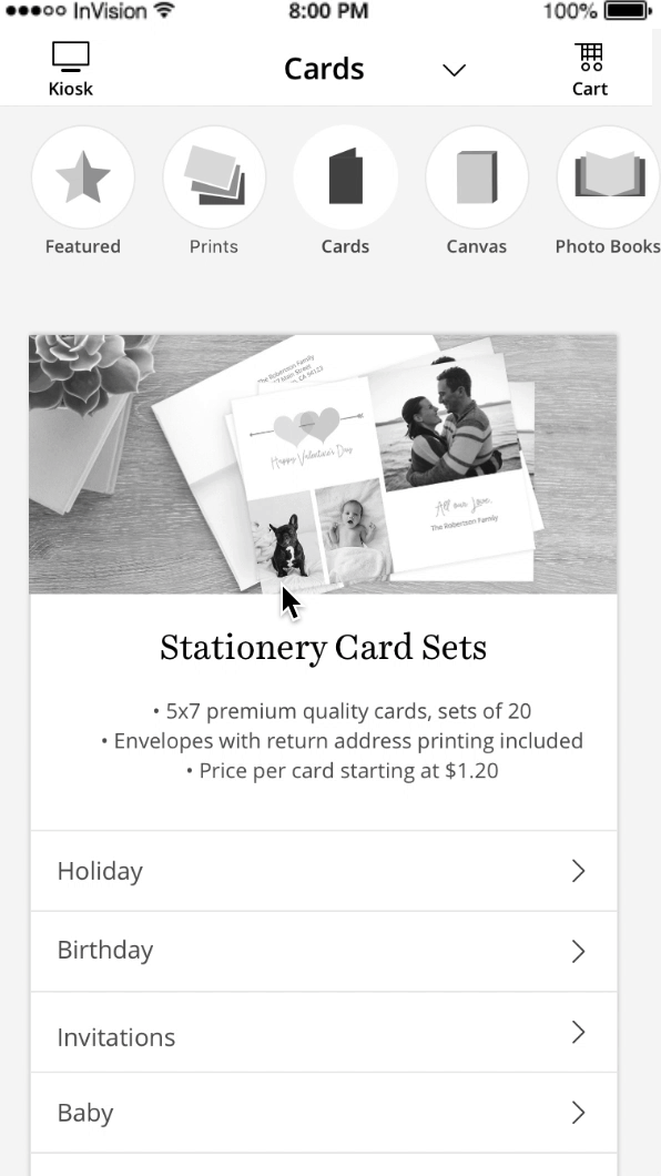
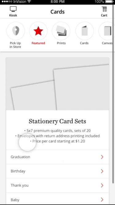
Final App Solution
The final App product is an easy way to select and build greeting cards.


The actual builder now has much clearer price transparency and provides an intuitive way to select the corner options.


High-Fidelity Prototype
Finally, I created a high fidelity prototype to refine the overall user interaction and fine-tune the user flow. It is important to note that this was an iterative process and many fine tweaks were made to improve the overall design. A refined prototype is also a great way to communicate design language to the developers in comparison to just handing over the design stills.
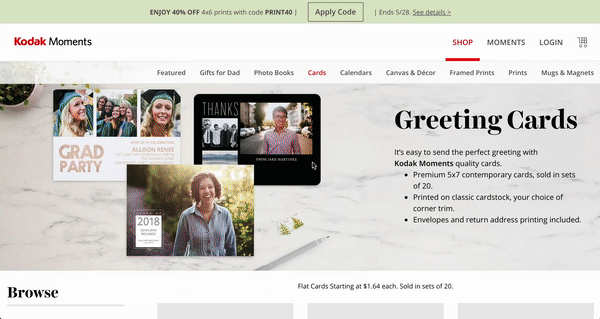
Final Web Solution
The core usability issues with the web were the same as the app but the design implementation had unique challenges. The design required was a left panel layout to save space and to account for smaller device screens. I worked with the design team to refine a lot of the web designs and user flow.


Other UI Challanges
At Kodak I also worked on various design challenges which required less time but had a high impact on the overall product.
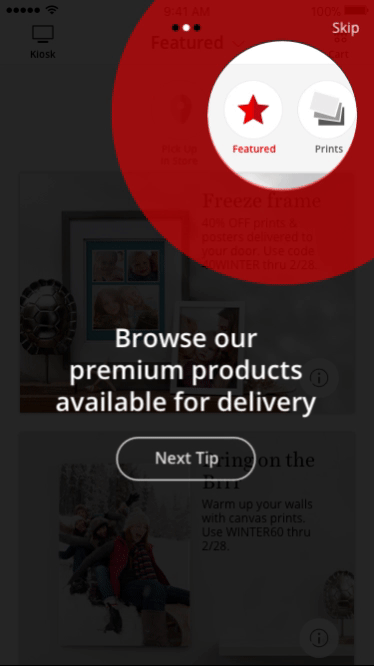
Onboarding Design Challenge
During the user research, we found out that a lot of the product categories were not easily discoverable on the landing page. My role was to find a way to make these products more discoverable. The solution was to increase the discoverability fo the categories using animation.
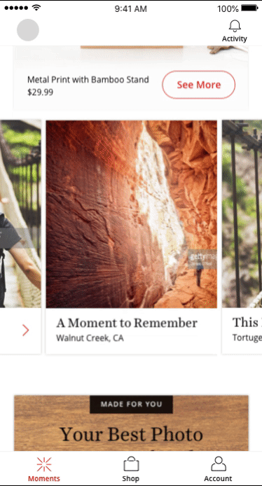
Moments Discoverability
Moments is a very important feature on the Kodak App. This is where we showcase user photos onto various products to create a sense of personalization and to upsell our products. My role was to implement a quick design solution which would help the personalized items stand out from the promotion cards.